n8fit app

n8fit app

n8fit app

project overview

branding
Ux research

UI/UX Design

N8Fit is an 8-week systematic, sustainable one-on-one online coaching app for women who are ready to gain their confidence back by optimizing physical health.

This was a solo project that spanned 12 weeks, during which I meticulously oversaw every aspect from inception to completion, always ensuring a seamless user-centered approach. I utilized industry-standard UX methodologies and tools such as Figma, Miro, and Photoshop to achieve this.

Challenge
& solution

Through user interviews, I discovered that busy women, including working moms, frequently encounter difficulties adhering to diet and training plans. This challenge arises from the unclear and complex nature of existing fitness and nutrition services.

Solution is to enhance coaching through user-centered online program for efficient fitness and nutrition support, empowering goal achievement.

JOURNEY

EMPATHIZE

DEFINE

ideate

design

test

Empathize

User interviews
& insights

To gain a more profound understanding of current market dynamics and user needs, I conducted user interviews.

I interviewed participants in their 40s with coaching app experience to understand challenges faced by busy women and moms. Using an affinity map, I validated the need for an online coaching app with a systematic, sustainable approach.
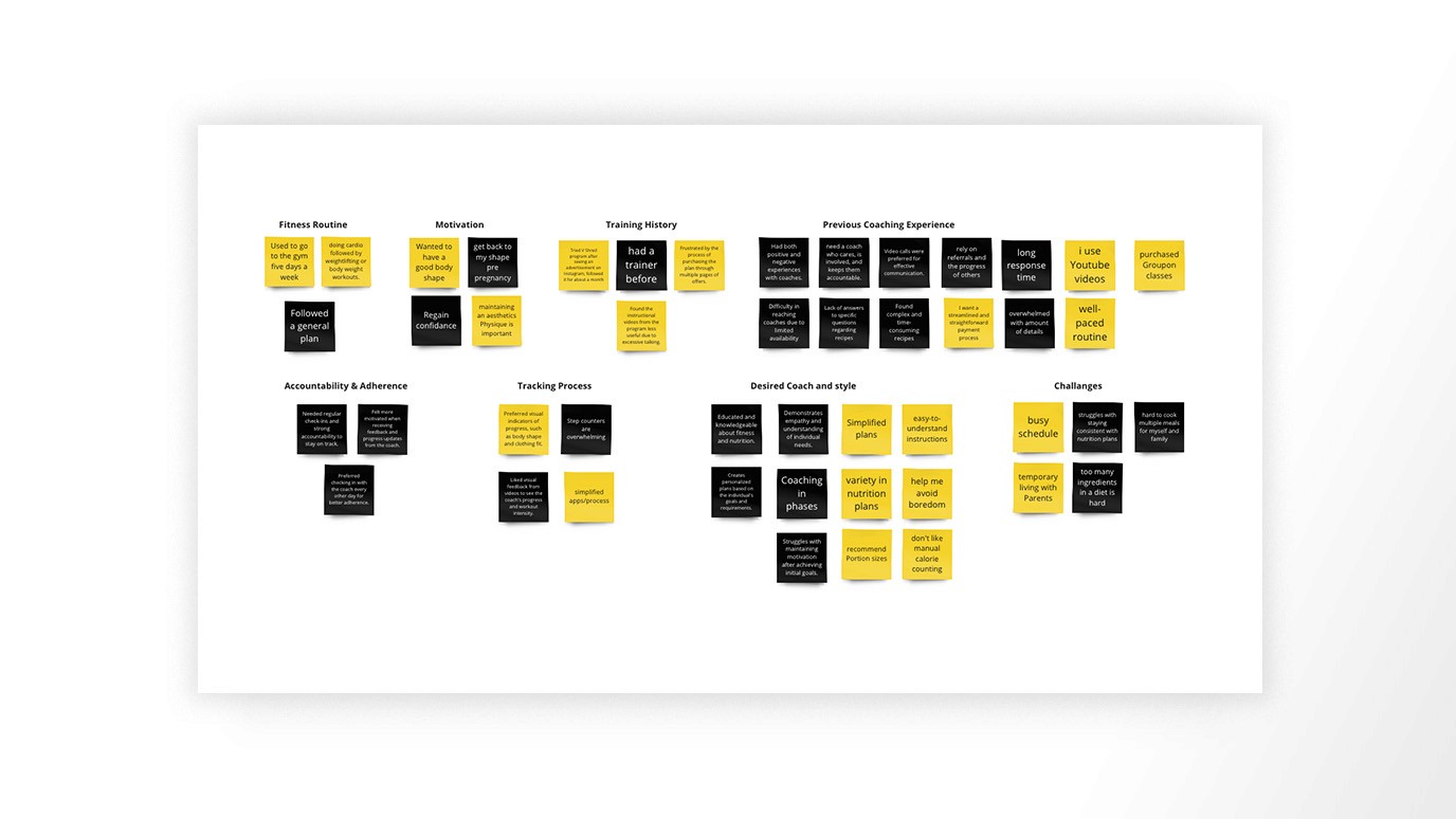
INSIGHTS:
1. Users require Structure and Flexibility
due to unpredictable daily routines.
2. Accountability and Virtual Feedback
are crucial components.
3. Multiple support access points are essential for users.

INSIGHTS:
1. Users require Structure and Flexibility
due to unpredictable daily routines.
2. Accountability and Virtual Feedback
are crucial components.
3. Multiple support access points are essential for users.

Define

Affinity map
& user Persona

After delving deeper into understanding users' needs and objectives, I employed an affinity map to effectively organize information and gain a holistic view of the user challenge. Subsequently, I used the insights obtained through my discovery research and the affinity map to construct a comprehensive user persona.

ideate

2x2 matrix
& sketch

I utilized the 2x2 matrix approach for effective decision-making and data visualization. This method offers a structured framework to guide resource allocation and efforts, ensuring that the product's success aligns with users' actual needs, not just my assumptions about their priorities.

I also employ rapid sketching to understand users and identify potential solutions.

design

user flow,
wireframe,
design system,
prototype

I integrated user flow with research insights and a common user challenge to emphasize accountability. I achieved this by introducing a streamlined check-in feature in the app, simplifying the process and boosting efficiency for clients and coaches while reducing overwhelm. Additionally, I developed a mid-low fidelity wireframe to spotlight the project's key focus areas.

The next step involved creating a design system and developing a prototype.

Test

I conducted two rounds of testing with three participants in each, revealing crucial insights.


ROUND 1 OF TESTING:

1. In Step 1/3, the weight loss overview was unclear due to the "Day" in yellow, causing confusion.
2. The weight input section was too small, leading to ambiguity.
3. The "Final Thoughts" section ( in earlier design) felt redundant compared to Bio Feedback, and users were overwhelmed by the Coach's Feedback flow.

ROUND 2 OF TESTING:
1. Despite relocating the weight input section to the top of the screen in Step
1/3, confusion persisted.
2. An overlay introduced to prompt users to review their messages was often overlooked.


CONCLUSION:

I streamlined content organization to minimize confusion, addressed the
recurring weight input issue with an
overlay, and improved message visibility
to prompt users to check their messages after completing a task.

© 2022 Tannaz Taheri. All Rights Reserved.